
Gold Foil Label Design Ideas: How to Use Foil on Logos, Borders, Type and Patterns
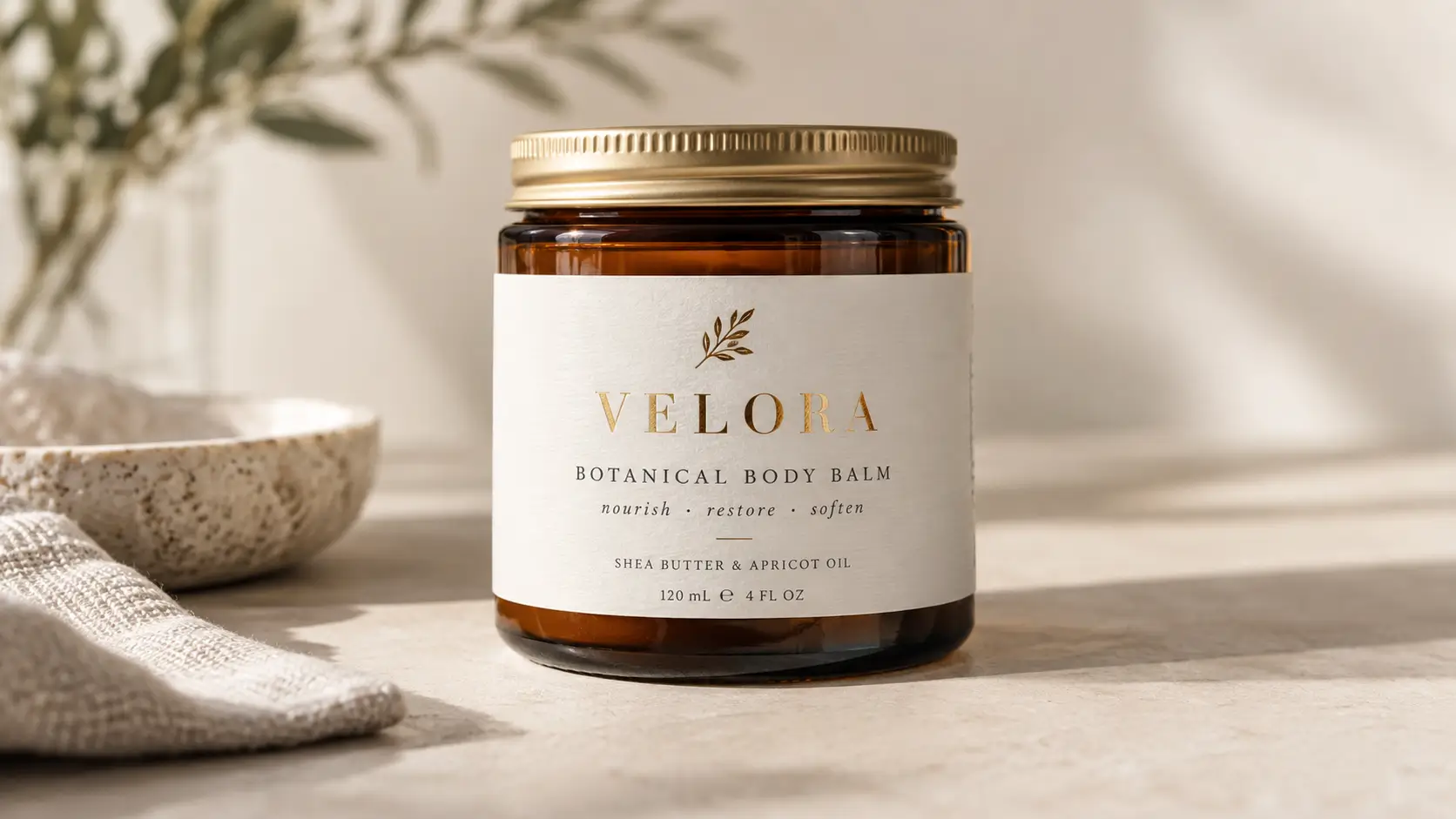
Effective gold foil label design ideas use foil selectively: highlight a logo, brand name, border, icon or pattern while keeping product information easy to read. Start with the element shoppers should notice first, then choose the background and foil tone. Confirm fine details and material compatibility through artwork review and an appropriate physical sample before production.
For small brands developing bottles, jars, pouches or gift packaging, the useful question is where metallic emphasis helps the design. A decorative label still needs to identify the product and distinguish its variants.
What makes a gold foil label design work?
Give foil a specific job: identify the brand, frame the product name or mark a special edition. Keep supporting information visually quieter.
Before deciding where to add foil, ask one question: what should the shopper notice first when the label catches the light?
Use that answer to choose one dominant foil element. Add secondary accents only if the product name and variant remain clear at the label’s actual size. Judge the composition on its intended package, including the front-facing area of a curved container.
Eight practical gold foil label design ideas
1. Foil logo only
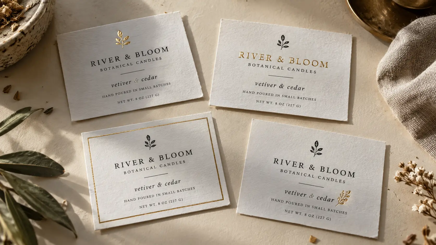
Foil the symbol and print the brand name, product name and variant in ordinary ink. Try a compact monogram above a clearly printed scent name on a candle jar. This gives the metallic treatment a defined role. If the logo has fine internal details, ask the printer to review a simplified version at final size.
2. Foil wordmark
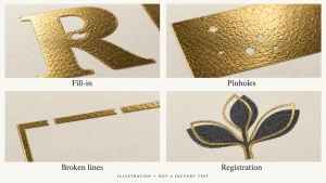
Use foil on the brand name when the lettering itself carries the identity. Keep the product descriptor in print underneath. Review the narrowest strokes and the openings inside letters: Blue Label Packaging’s hot-foil guide warns that small gaps can fill and that font suitability depends on letter geometry. Its specifications apply to its process, not every printer. [1]
3. Thin border or frame
Try a restrained frame around a printed central panel for a bottle or gift-box label. Keep it comfortably inside the cut edge. Thin frames make uneven spacing conspicuous; the LabelsAgent proof checklist identifies both foil-to-print alignment and cutting position as checks for borders. Ask the printer to confirm the proposed spacing. [2]
4. Small product-detail icon
Foil a simple botanical sprig, bean silhouette or other relevant motif beside the product name. Prefer a recognizable shape over miniature illustration. The icon should support the product story without implying an unsupported certification or ingredient claim. Keep explanatory text in print so the illustration does not have to communicate everything.
5. Pattern used as a background accent
Try a sparse repeat along one edge or behind an otherwise empty section. Leave a clear reading area around the product name and variant. For a tea pouch, a few separated leaf shapes may be a useful starting concept. Compare that with a plain background before committing to a denser pattern.
6. Foil seal or badge
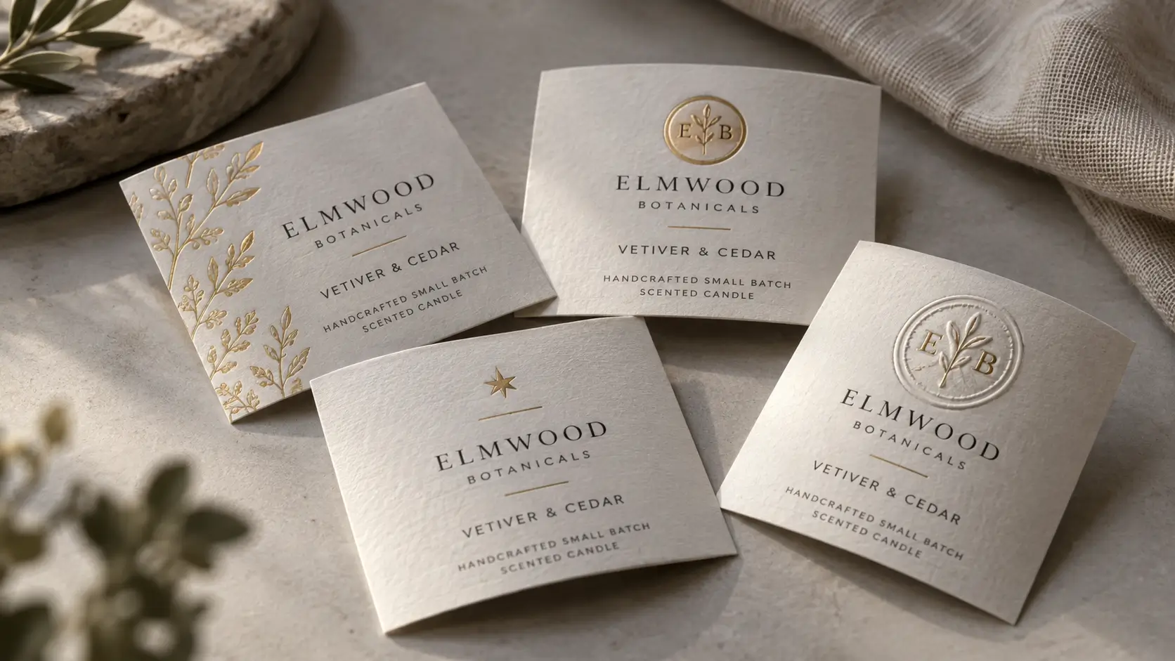
Place a monogram or a truthful collection name inside a simple badge. It can sit on the main label or a separate decorative sticker. Avoid making the badge resemble an award the product has not received. A decorative closure sticker should not be described as tamper-evident unless that function is separately specified and verified.
7. Limited-edition marker
Foil a small edition name or seasonal motif while retaining the familiar core layout. For example, a holiday release could use a gold star beside a printed seasonal name. Only use “limited edition” when accurate. Confirm every version independently so an edition marker is not accidentally carried into the regular range.
8. Foil combined with embossing
Consider a raised, foiled monogram when touch is part of the intended presentation. Embossing adds raised detail; the texture already present in a paper stock is a separate choice. Specify the foil and embossing areas separately and ask for confirmation of their alignment and suitability on the selected label construction. [4]
Logo, border, type or pattern: which should receive foil?
Choose the placement that supports the label’s main communication task. If the brand name needs emphasis, start with the wordmark. If a strong printed identity already exists, consider a border or secondary motif. Use the matrix below as a practical starting point, then review the concept at final size on the intended package.
| Brand goal | Recommended starting placement | Packaging concept to try | Main risk to review |
|---|---|---|---|
| Emphasize an established symbol | Logo only | Jar or bottle front label | Fine logo detail |
| Make the name the focal point | Wordmark | Simple cosmetic or fragrance label | Narrow strokes and letter gaps |
| Organize a printed information panel | Border | Wine bottle or gift box | Uneven spacing near the cut |
| Extend an illustration theme | Sparse pattern or icon | Tea pouch or specialty-food jar | Competition with the product name |
| Distinguish a special release | Badge or edition marker | Seasonal packaging | Confusion between versions |
If you already know which element should receive foil, compare available materials, foil options and ordering formats on the custom gold foil label page before finalizing the production brief.
How much of the label should be foil?
Start with low coverage and add foil only when the extra area serves a clear purpose. Treat low, medium and high as qualitative design descriptions rather than fixed percentages.
Foil coverage and foil complexity are separate decisions. A small intricate crest can be harder to review than a larger simple wordmark, so evaluate fine detail independently from the total metallic area.
| Coverage | Example | Design benefit to explore | Question before approval |
|---|---|---|---|
| Low | One logo, wordmark or icon | A single clear emphasis | Is the selected element prominent enough? |
| Medium | Wordmark plus frame or separated motifs | A coordinated decorative system | Can the variant still be found quickly? |
| High | Broad foil panel or extensive pattern | A deliberately metallic presentation | Does reflection interfere with essential reading? |
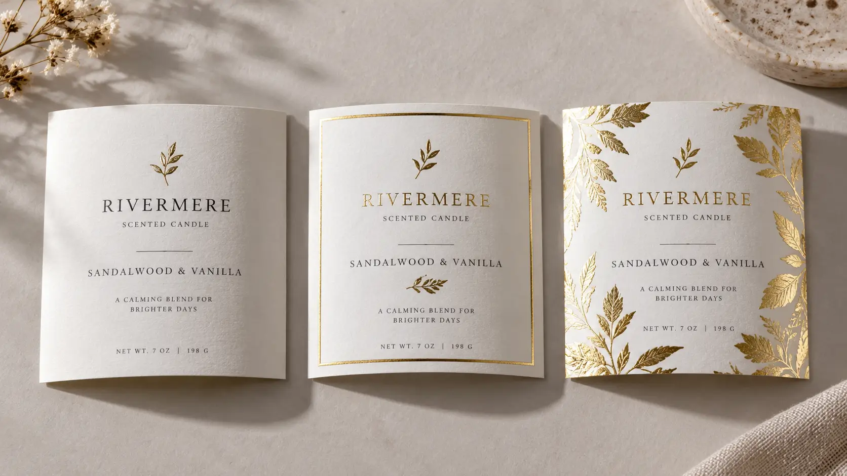
Low coverage is not automatically easy to reproduce: a tiny intricate crest still needs detail review. Large foil areas need their own assessment. LabelsAgent’s artwork guidance distinguishes dense-line risks from uneven transfer in large solids. [6]
How backgrounds change the gold effect
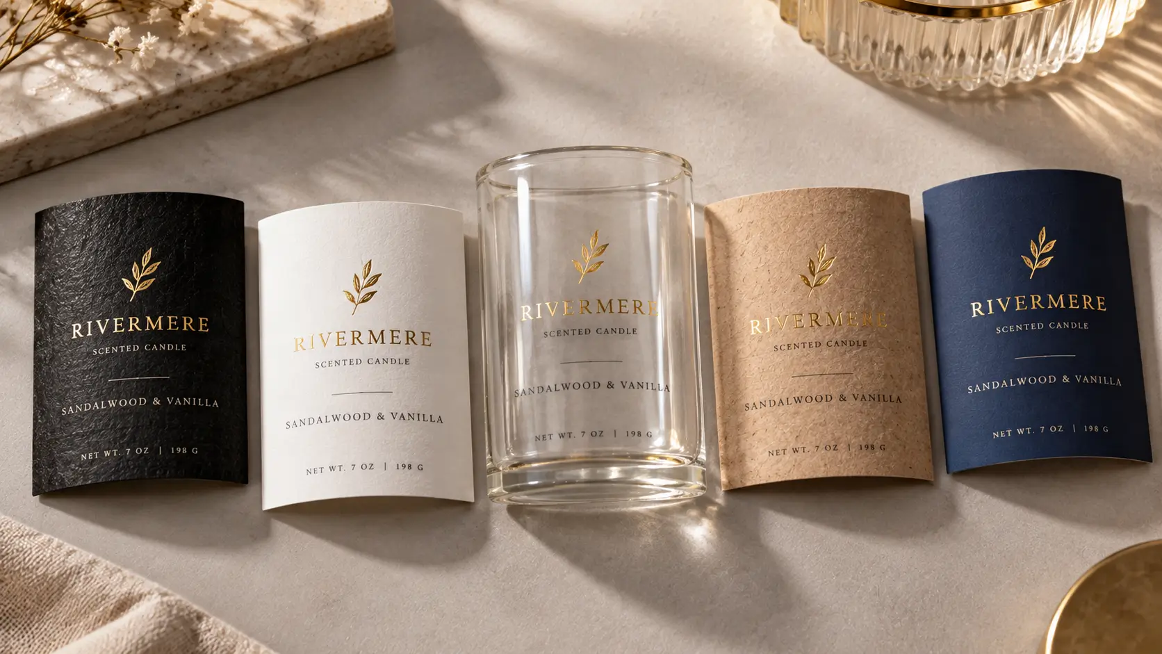
Shortlist backgrounds by appearance, then confirm the actual label construction. Paper or film names alone do not establish foil compatibility. LabelsAgent’s material guide identifies surface treatment, texture, coatings and the selected foil process as variables that need consideration together. [3]
Black textured paper
Try a gold monogram with generous empty space and clearly separated product text. LabelsAgent currently lists Black Textured Paper, but that listing does not verify your design’s foil performance. Confirm compatibility using the specific paper, foil, artwork and a suitable physical sample. [4]
White paper or white film
Try a gold wordmark with dark printed product information for a restrained layout. Compare it against the actual container rather than a white screen alone. Choose paper versus film according to the packaging and use conditions; a similar white appearance is not evidence of equivalent performance.
Clear film
Treat the container and its contents as part of the background. Check the proposed label on the filled package. Identify where printed elements need an opaque white backing and where transparency should remain; confirm the white-ink plan with the printer. The material guide specifically flags viewing background and white underprinting for clear BOPP. [3]
Kraft paper
Try a simple foil emblem alongside dark printed type. Evaluate the gold against a physical kraft swatch. Roughness and absorbency can affect foil transfer, so request review of the chosen stock instead of borrowing an approval from smooth paper or film. [3]
Colored printed backgrounds
Compare the same foil design against navy, burgundy or deep green concepts. Keep placement constant while evaluating the palette. Ask the printer to confirm the ink, coating and foil combination, and use a physical sample when the final color relationship is central to the design.
Choose gloss, matte, champagne or rose gold
Choose the color family and surface finish separately. “Champagne” describes a shade direction, while gloss and matte describe finish. For example, Foilco lists Champagne Gold 6109 with a satin finish, illustrating why a color name alone is insufficient. That product listing does not establish availability through another supplier. [5]
Use these as visual directions for a sample shortlist:
– Gloss gold: consider it when a bright metallic accent is part of the brief.
– Matte gold: compare it when you want a more subdued metallic appearance.
– Champagne gold: explore a paler gold direction alongside cream or muted colors.
– Rose gold: explore a pink-toned direction alongside blush, white or warm neutrals.
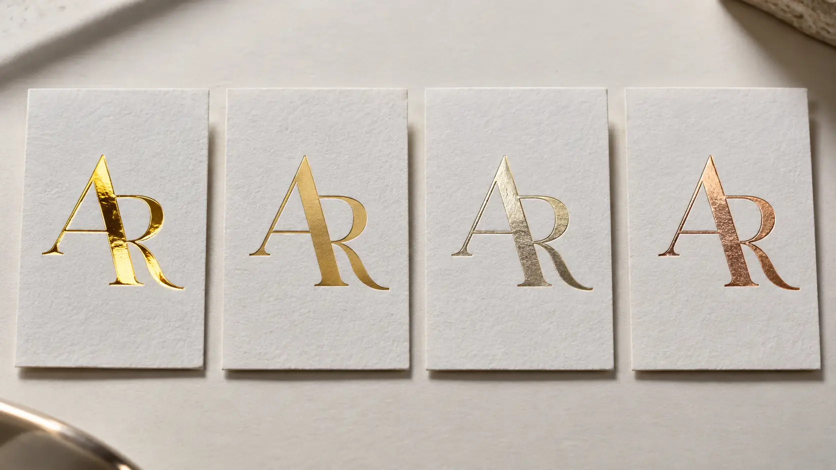
Approve a specific foil reference, not simply “gold.” View it beside the lid, container and outer packaging so the foil tone is judged as part of the complete color system.
Prepare artwork and approve the proof
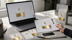
Keep foil shapes separate from printed artwork. LabelsAgent requests solid vector elements on a dedicated Foil layer, with outlined text and a separate cut line. Use the Foil Artwork Guide for the complete file requirements. [6]
Review a foil-only view and a combined preview. Confirm the wordmark, border, edition marker and each variant at final size. Flag narrow gaps, fine strokes and details close to the cut edge using the Foil Proof Checklist. [2]
Avery states that electronic proofs approximate color rather than exactly matching printed output. Treat screen approval as a layout checkpoint; request physical evidence when foil tone, texture or the finished appearance remains unresolved. [7]
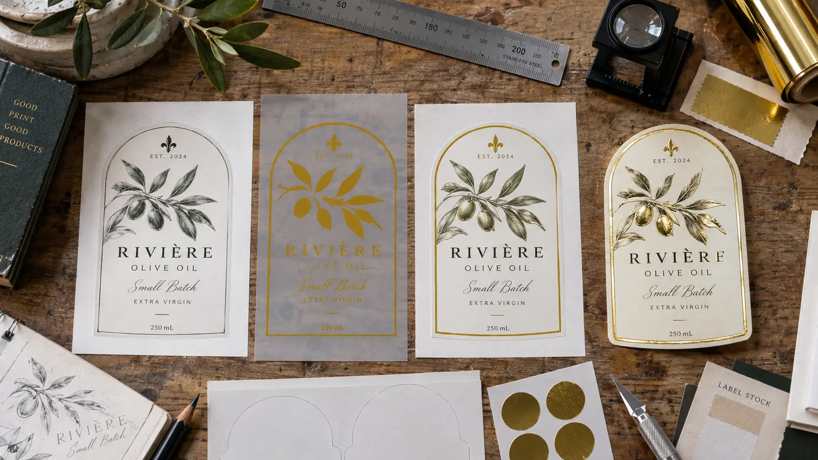
Final design checklist
Before requesting production review, record:
– Packaging: surface, container shape and usable label area.
– Material: exact paper or film, including coatings where specified.
– Environment: moisture, oil, refrigeration, handling or other relevant exposure.
– Foil tone: supplier reference and intended finish.
– Placement: the specific logo, type, frame, icon or pattern receiving foil.
– Artwork: finished dimensions, print artwork, foil layer and cut line.
– Format: rolls, sheets or individual stickers; application requirements where relevant.
– Quantity: labels per design and the complete variant list.
– Samples: what still needs confirmation, including appearance and compatibility.
With these decisions recorded, explore custom gold foil label options and submit the selected concept for review.
FAQ
Can I use small serif lettering in gold foil?
Possibly, but review the actual outlines with the printer. Point size alone does not describe thin serifs or the spaces inside letters. Blue Label Packaging’s guide illustrates these failure risks. Keep essential small information in print if the proposed foil detail cannot be confirmed. [1]
Is a foil border a better choice than a foil logo?
Choose a border when framing the printed panel serves the design; choose a logo when the symbol should receive emphasis. Neither is universally better. Compare both at final size on the intended package, paying particular attention to whether the product name and variant remain clear.
Should every product variant have a different foil color?
Only if that variation helps the range remain understandable. A useful starting concept is a consistent foil identity with printed variant names or color panels. Do not rely on a subtle foil-tone difference alone to distinguish products. Review the whole range together before approving individual labels.
Can a digital mock-up confirm the final foil appearance?
No. Use it to evaluate the composition and indicate foil placement. Avery’s guidance explains that electronic proofs are not exact printed-color matches. When the finish itself determines your choice, request a relevant physical sample and assess it beside the intended packaging before approving the appearance. [7]
References / Source List
Only sources used in the article are listed. Date checked for every entry: September 21, 2026. Public brand documentation describes published guidance; it is not independent validation of manufacturing performance.
[1] Blue Label Packaging — Hot Foil Stamping Embellishment Guide
– Source Type: Manufacturer / first-party printer technical guidance.
– Used For: Letter geometry, narrow gaps, fine strokes and printer-specific hot-foil requirements.
– Published / Updated Date: Not stated in the document; upload path contains December 2022, which is not treated as a verified publication date.
– Date Checked: September 21, 2026.
– URL: Hot Foil Stamping Embellishment Guide.
[2] LabelsAgent — How to Approve a Foil Label Proof Before Production
– Source Type: Brand / first-party technical guidance.
– Used For: Border alignment relative to printing and cutting; foil-only and composite review; approval checkpoints.
– Published / Updated Date: August 31, 2026, displayed publication date.
– Date Checked: September 21, 2026.
– URL: Foil Label Proof Approval Checklist.
[3] LabelsAgent — Foil Label Material Guide: Choose the Right Substrate for Your Packaging
– Source Type: Brand / first-party technical guidance.
– Used For: Specific substrate/process review; clear-film viewing backgrounds; kraft roughness and absorbency considerations. Numerical material ratings were not used.
– Published / Updated Date: July 2026, displayed update month.
– Date Checked: September 21, 2026.
– URL: Foil Label Material Guide.
[4] LabelsAgent — Textured Paper Labels
– Source Type: Brand / product page.
– Used For: Current listing of Black Textured Paper and the distinction between intrinsic paper texture and added embossing. Not used as evidence of successful foil testing.
– Published / Updated Date: Not established from the retrieved page.
– Date Checked: September 21, 2026.
– URL: Textured Paper Labels.
[5] Foilco — Champagne Gold 6109
– Source Type: Manufacturer / product specification.
– Used For: A named champagne-gold foil specified with a satin finish; illustrates shade versus finish. No LabelsAgent stock or compatibility claim is inferred.
– Published / Updated Date: Not stated in the retrieved page content.
– Date Checked: September 21, 2026, web retrieval; separate direct request returned HTTP 403.
– URL: Champagne Gold 6109.
[6] LabelsAgent — Foil Label Artwork Guide: How to Prepare Files for Custom Foil Printing
– Source Type: Brand / first-party technical guidance.
– Used For: Dedicated vector Foil layer, solid artwork, outlined text, separate cut line and distinct review of dense detail versus large solids.
– Published / Updated Date: July 13, 2026, displayed update date.
– Date Checked: September 21, 2026.
– URL: Foil Label Artwork Guide.
[7] Avery — Artwork Guidelines
– Source Type: Manufacturer / first-party printer technical guidance.
– Used For: Electronic proofs approximate color and are not exact matches to printed output.
– Published / Updated Date: Not stated on the retrieved page.
– Date Checked: September 21, 2026.
– URL: Artwork Guidelines.