

What Should a Professional Handmade Candle Label Look Like?
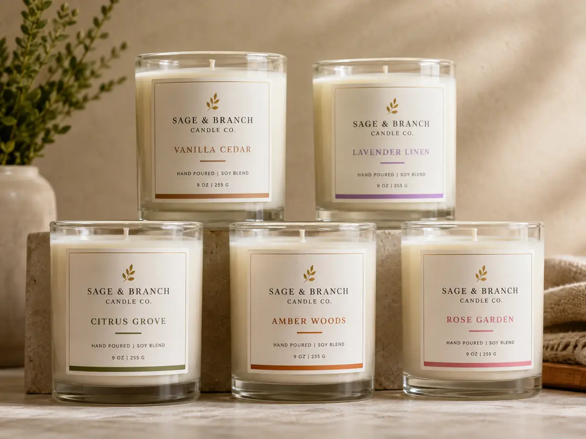
A professional handmade candle label should look clear, deliberate, and trustworthy before it looks decorative. The front should communicate the brand, fragrance or product identity, and net quantity within a few seconds. Supporting information and safety warnings should remain readable without crowding the main design. Use a consistent type hierarchy, controlled color palette, suitable material, and one purposeful finish. LabelsAgent manufactures custom candle labels with no minimum order, but candle makers should supply finished artwork or work with a designer before production.
For products covered by the U.S. Fair Packaging and Labeling Act, packages generally need three categories of information: the identity of the commodity, the name and place of business of the manufacturer, packer, or distributor, and the net quantity of contents. NIST also notes that its model Uniform Packaging and Labeling Regulation has been adopted into law in 45 of the 50 U.S. states. Requirements vary by market, so a professional label begins with the information the finished product must carry—not only with a logo and fragrance name. Source: ftc.gov
Build a Clear Information Hierarchy
A customer should not need to study the label to understand the candle. The front panel should answer four questions in a predictable order:
- Who made it?
- What is the product or fragrance?
- How much product is inside?
- Is there a useful collection, wax, or scent descriptor?
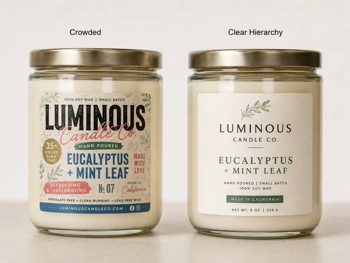
Professional labels do not give every answer equal visual weight. They use one dominant element, one supporting element, and one quiet information layer.
Organize the Label by Surface
| Label area | Primary job | Typical information | Common mistake |
|---|---|---|---|
| Front | Sell and identify | Brand, fragrance, candle type, net quantity | Too many equal-size messages |
| Back or side | Explain | Scent notes, maker information, website | Long brand story in tiny type |
| Base | Protect and instruct | Safety warning, batch code, burn guidance | Warning label too small or obstructed |
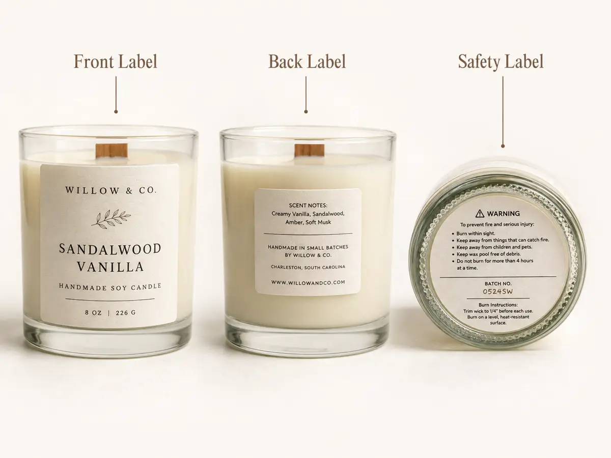
A small jar does not need a miniature version of a large label. It needs a smaller information system. Removing secondary copy is usually more professional than shrinking every line until it becomes difficult to read.
Professional candle packaging is often created by controlled omission. It looks premium because every visible element has a clear job, not because every available space is filled.
The FTC’s three basic package declarations—identity, business responsibility, and net quantity—also support a useful design principle: separate essential product information from promotional language so buyers can identify and compare the product easily.
Make Typography, Spacing, and Color Feel Intentional
Typography is one of the fastest ways to distinguish a professional label from a homemade-looking one. A practical system for a small candle brand is:
- No more than two typeface families;
- Three visible levels: brand, fragrance, and supporting information;
- Consistent capitalization across every scent;
- One alignment system;
- Clear empty space around the logo and fragrance name.
These are design starting points, not legal measurements. Readability depends on the font, print process, contrast, viewing distance, and material.
Print the artwork at 100% scale, review the label artwork requirements, and inspect the design on the actual jar before production. A font that looks elegant at high screen zoom may lose thin strokes or become unreadable in print.
Use Contrast Before Decoration
A professional label should remain understandable before foil, embossing, texture, or spot gloss is added. Test the artwork in grayscale:
- Can you identify the brand?
- Can you read the fragrance name?
- Can you find the net quantity?
- Is the supporting information still legible?
If not, metallic finishing will not repair the hierarchy.
A restrained palette is easier to control across several fragrances. One base color, one text color, and one variable accent can create a coherent collection without requiring a completely different label for every scent.
| Visual system | Recommended structure | Suitable position |
|---|---|---|
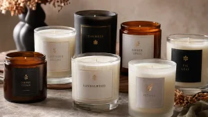
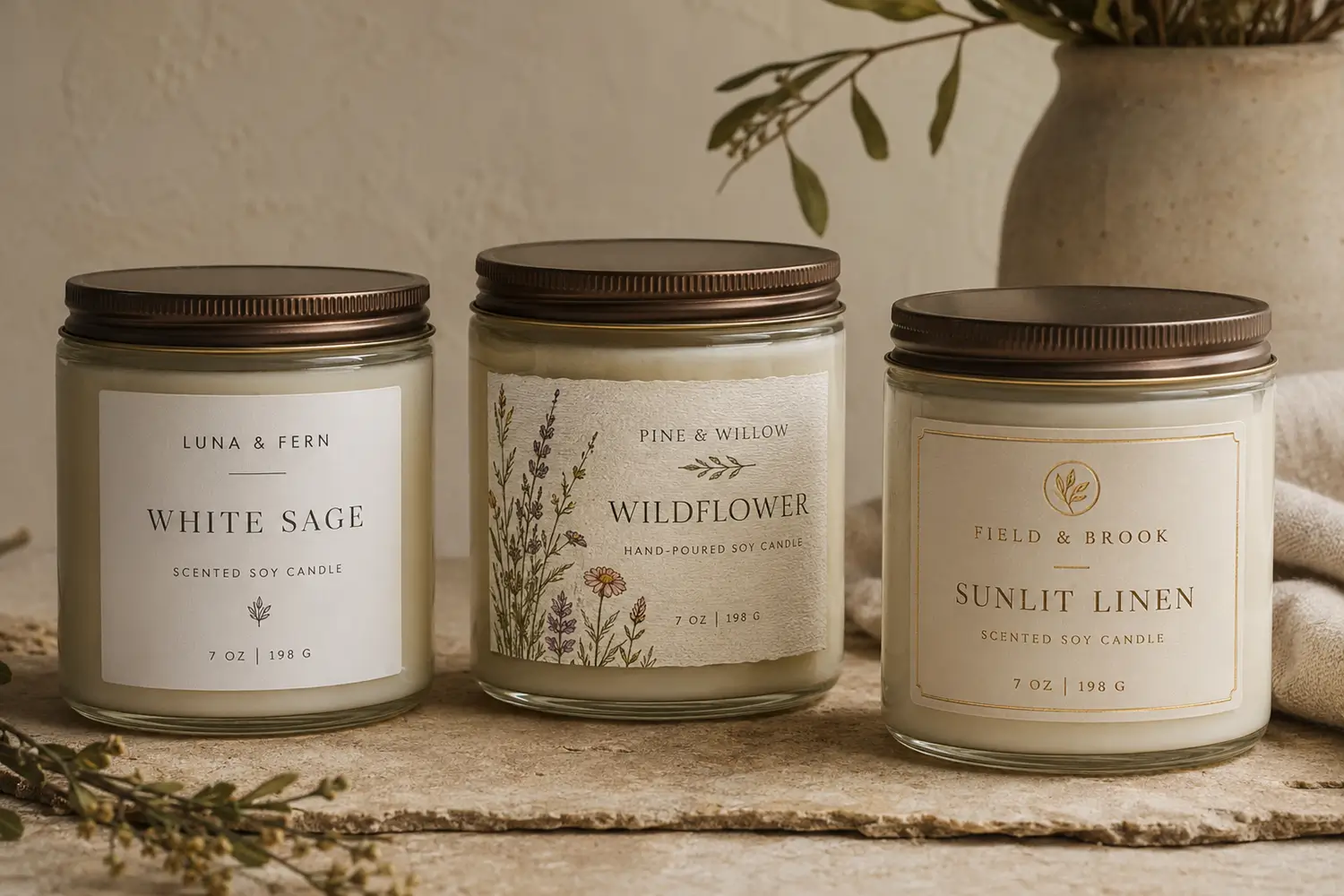
| Minimalist | Neutral base, strong typography, small metallic accent | Modern and premium |
| Botanical | Soft base, restrained illustration, clear text panel | Natural and artisan |
| Apothecary | Structured border, serif type, batch-style details | Heritage and handcrafted |
| Gift-focused | Rich color, foil logo, simplified supporting text | Seasonal and celebratory |
Match the Material and Finish to the Brand Promise
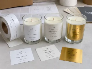
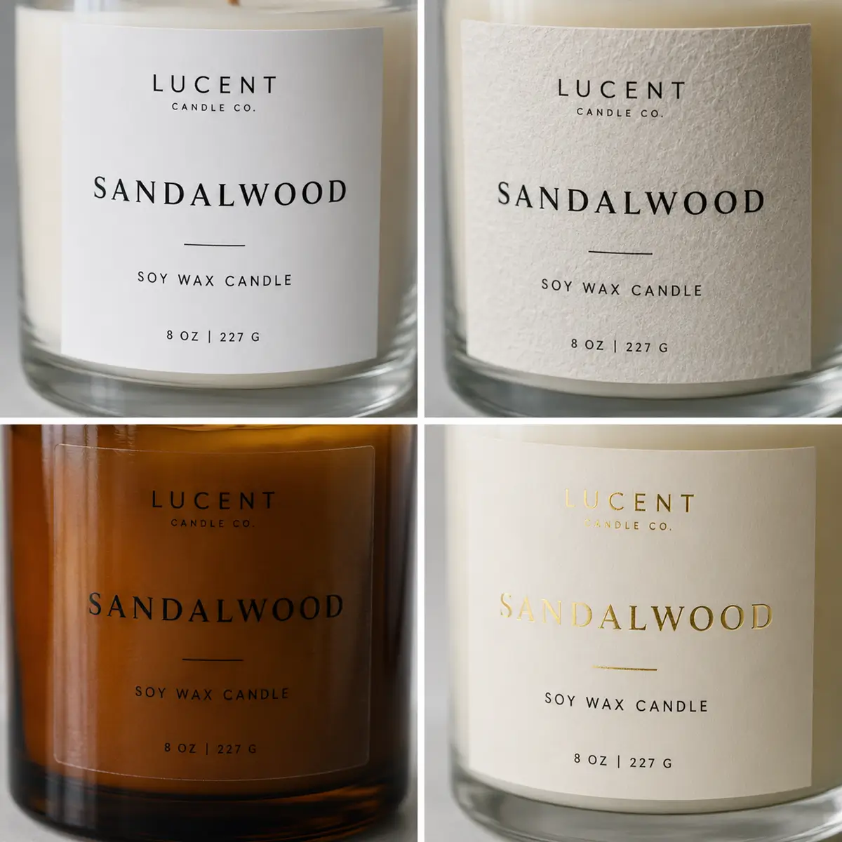
Kraft paper, smooth white film, textured estate paper, and clear BOPP can all look professional. Use the foil label material guide to compare their appearance, durability, and finishing compatibility.
Use smooth white film when clean detail, moisture resistance, and repeatability matter. Use textured paper when touch and handcrafted character are central to the brand. Use clear film when the vessel or wax color should remain visible, but test it on the filled candle because transparent labels reveal bubbles, fingerprints, and weak contrast more easily.
Finishes should have a defined role:
- Custom gold foil labels can suggest warmth, heritage, celebration, or luxury when foil is limited to the logo, fragrance name, border, or another deliberate focal point.
- Rose gold foil can suit floral, wedding, self-care, and gift collections;
- Silver foil can reinforce clean, cool, or contemporary positioning;
- Matte lamination can reduce glare;
- Spot gloss can isolate a logo or pattern.
Use premium finishing as punctuation, not as the whole sentence. A small foil logo or fragrance name often creates more hierarchy than a fully reflective background.
LabelsAgent produces mature, high-quality custom labels at cost-conscious prices and without a minimum order. It does not provide brand concept or design-direction services.
Candle makers should submit production-ready artwork or work with an independent designer, then use the production discussion to confirm material, finish, size, and manufacturability.
Keep Safety and Market Requirements Visible
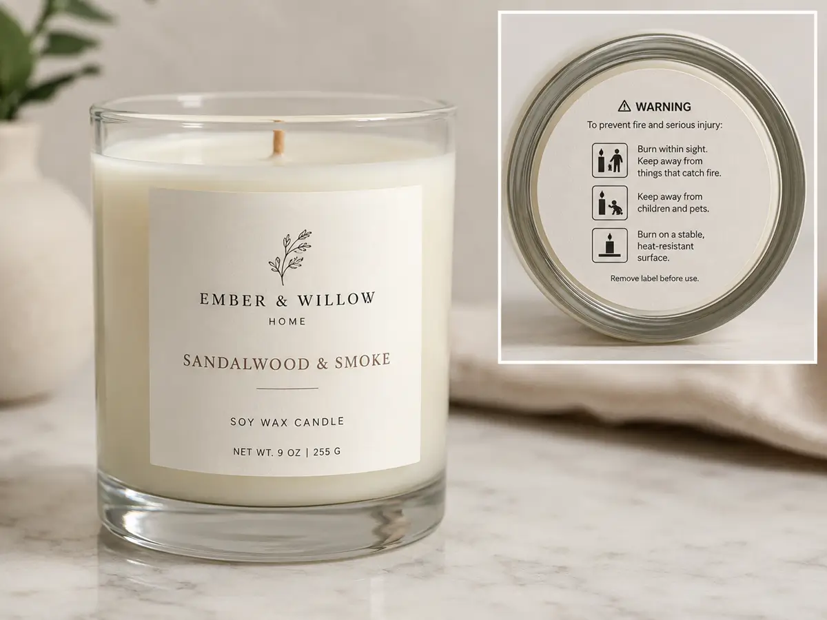
A professional candle label does not hide safety information to preserve a clean aesthetic.
ASTM F2058-07(2021) is the active U.S. standard covering fire-safety information on candle units of sale. ASTM states that the warning must be visible at the point of sale and must not be covered or obstructed. Source: store.astm.org
The National Candle Association summarizes three central safety rules:
- Burn within sight;
- Keep away from combustibles;
- Keep away from children.
These warnings can sit on a separate base or back label so the front remains visually focused, but they must remain readable and securely attached.
For scented candles sold in the EU or UK, fragrance ingredients may trigger chemical classification and labeling duties. Official guidance treats candles as mixtures on a carrier and explains that sensitizing fragrance ingredients can require hazard wording or pictograms.
ECHA states that a hazardous mixture label may need supplier information, product identifiers, nominal quantity, pictograms, signal words, hazard statements, and precautionary statements. Source: hseni.gov.uk
Requirements depend on the formula and destination market. Do not copy a competitor’s warning panel; review the fragrance supplier’s safety data and verify the rules for each sales market.
Create a Professional System Without Overspending
Small candle businesses do not need a new structure for every fragrance. They need a system that can be repeated accurately:
- One jar shape;
- One or two label sizes;
- One approved material;
- One permanent layout;
- Variable fragrance names or accent colors;
- One optional foil element;
- One standard safety-label format.
This reduces the variables that must be tested and reordered while helping customers recognize the brand across a shelf or online product grid.
No minimum order can be valuable during early testing because a business can produce labels for a new scent, photography sample, seasonal release, or small market test without committing to unnecessary inventory.
Before sending artwork to LabelsAgent, prepare:
- Final vector or high-resolution artwork;
- Exact jar dimensions and label placement area;
- Required label size and shape;
- Material and finish preferences;
- Quantity for each design;
- Destination market;
- Clear vessel photos or a physical sample when needed.
Keep the approved artwork version, material name, dimensions, finish, color reference, and physical sample together for future reorders. Production consistency is part of professional design.
Final Recommendation
A professional handmade candle label should be easy to recognize, easy to read, appropriate for the vessel, and ready for repeat production.
Start with a clear hierarchy:
- Brand;
- Fragrance or product identity;
- Net quantity;
- Supporting details;
- Visible safety information.
Limit type styles, use color consistently, and choose one finish that strengthens the brand rather than competing with it.
LabelsAgent offers cost-conscious, high-quality custom label production without a minimum order, allowing small candle businesses to test fragrances and seasonal releases with less inventory risk.
Because LabelsAgent does not provide design concepts, arrive with finished artwork and use the production discussion to confirm material, sizing, finish, and print feasibility.
Frequently Asked Questions
What information should be on the front of a candle label?
The front should normally identify the brand, candle or fragrance name, product identity, and net quantity. Keep promotional descriptions secondary. Manufacturer or distributor details and safety information may appear on another visible label, depending on the package and market requirements.
How many fonts should a professional candle label use?
One or two typeface families are usually enough. Use size, weight, spacing, or capitalization to create hierarchy before adding another font. Test the final artwork at actual print size on the jar rather than judging it only on a screen.
Do handmade candles need warning labels?
Candle makers should include appropriate fire-safety information. ASTM F2058 covers candle fire-safety labeling in the United States, while the National Candle Association highlights three core warnings: burn within sight, keep away from combustibles, and keep away from children. Other market-specific requirements may also apply.
Can a candle label look professional without foil?
Yes. Professional appearance comes primarily from hierarchy, spacing, typography, print quality, and consistency. Foil can add a premium focal point, but it cannot correct weak contrast, crowded text, poor alignment, or unsuitable material.
Does LabelsAgent design candle labels?
LabelsAgent manufactures custom labels but does not provide brand concept or design-direction services. Customers should provide finished artwork or work with a designer first. LabelsAgent can then help confirm production factors such as label size, material, finish, quantity, and print feasibility.